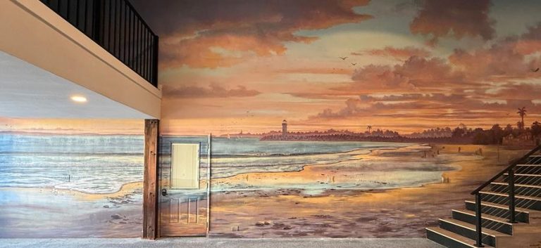
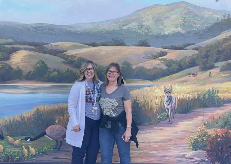
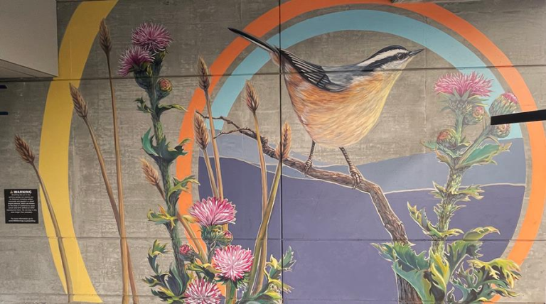
I love painting clean, modern aesthetics. The cluttered, overstuffed design of past generations no longer makes sense for the complex, jam-packed lives we live. Our cell phones keep us connected to constant activity and make sure we never have a dull moment. Sanctuary-inspired environments honestly thrill me.
Bishop Pass, the designers of the recently opened PABU Izakaya, a Japanese restaurant in downtown San Francisco, embraced a clean, pared down aesthetic for their new interiors. The design was inspired by elements of air and earth. Tall ceilings with big windows and Japanese lanterns celebrate air. Unfinished concrete walls, solid fir beams, black basalt counters bring in strong earth elements. The elements work together to create a clean, minimalist environment so that the focus can be on the food.
And you really want to focus on the food! Pabu is the eighth Michael Mina restaurant in San Francisco. He runs about twenty “destination restaurants”, all. The list of awards the Mina Group has won is impressive and extensive. I didn’t read the whole list, but enough to know that eating at a Mina restaurant should be on your bucket list. Maybe next time you are in Jackson Hole or Las Vegas…
Bishop pass reached out to me at the tail end of construction of the restaurant. The project was almost finished but they needed some artistic elements on the walls to finish the space off. It was as if they had designed a flawless “little black dress” but it needed a feminine yin element, a bit of bling, to balance out the solid and serious bones of the design.
At first, they had hired a street artist to create urban, graffiti style cherry blossoms. The artwork was black and heavy. Akin to wearing combat boots with the little black dress. Cool, but not the look they were going for.
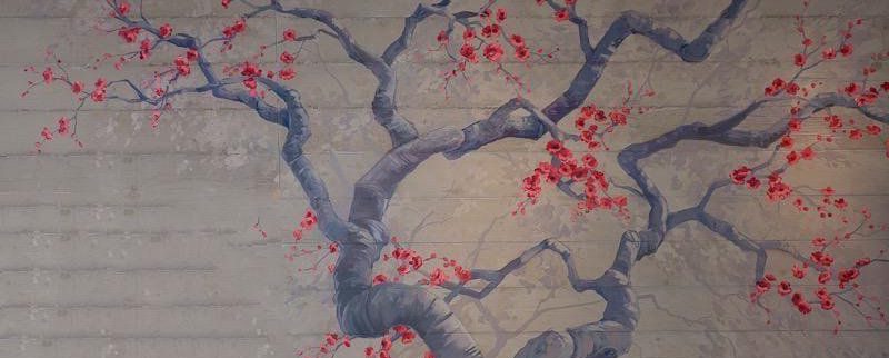
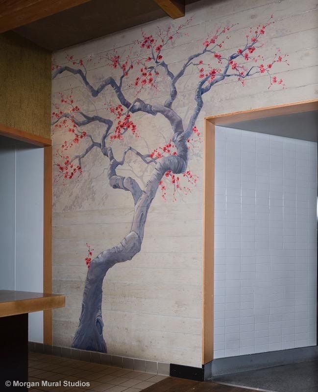
We started with a coral colored blossom mural behind the sushi bar. My aim was to create a piece that was dynamic and structurally interesting that would dance with the right angles in the space. The tree element extends out the far side of the bar, creating a delicate but dramatic visual element when you walk in the front door. Bling!
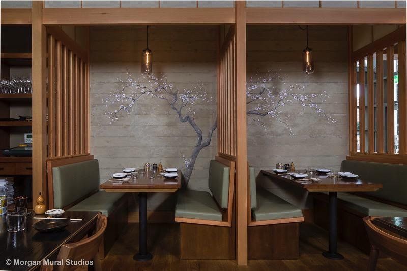
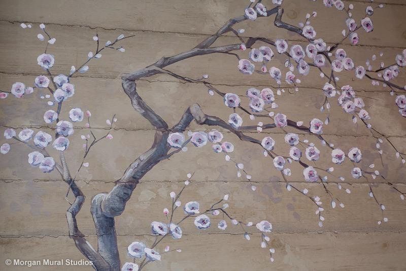
We chose white cherry blossom branches for the space above the five booths around the sushi bar. I focused on the structure, the twists and turns of the branches, and exercised restraint to keep the buds from all turning into blossoms. The “ghosting” in the background was used to “erase” the graffiti art of the previous artist, but it worked really well to create a soft depth to the compositions.
Japanese Landscape for the Bar
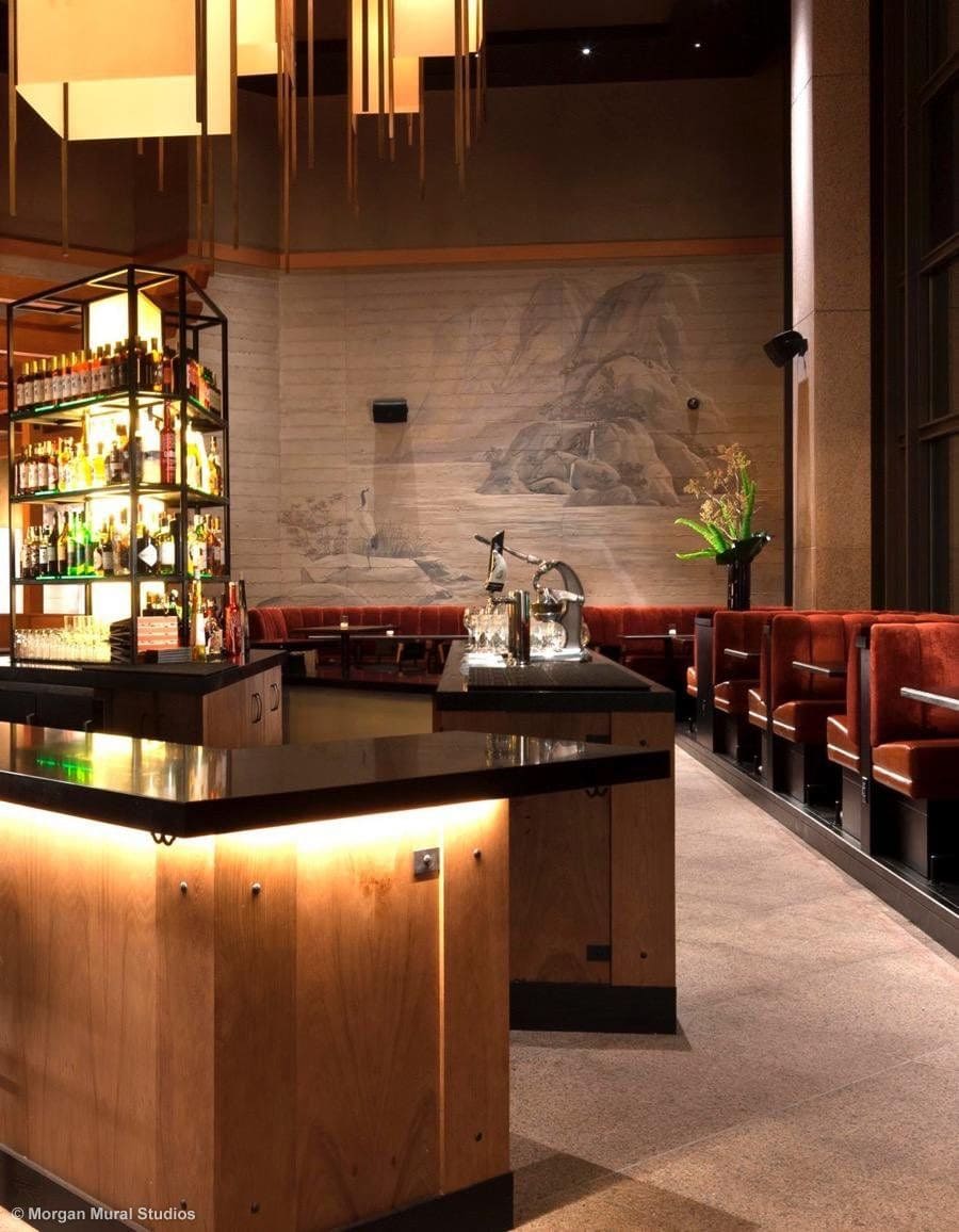
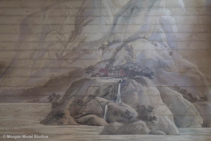
The back wall of the bar featured a huge wall that received lovely light from the full wall of windows along the north side. Bishop Pass wanted something soft and elegant that would not overwhelm the space. Keeping with the guiding design direction of air and earth, I created a sumi-e inspired landscape with the massive peaks painted in ghost greys to give the feeling of atmosphere. An elegant crane watches over the scene in the foreground.
Working over the raw concrete was very much like working with watercolors. Any bit of paint was quickly absorbed into the surface and could not be erased. For me, it was like doing aerial tricks without a safety net. The concrete turned dark when wet, so I couldn’t see how the colors were going to set until they dried a few hours later. The variation in the greys I used for this misty mountain mural was so slight I couldn’t visually differentiate them so I had to track the colors in my tray by memory. Oh yes, and working on a lift where you have to track the colors and lines over a large span while managing my driving skills around the finished carpentry… Truly, it was like painting blind, and without a safety net, and it was AWESOME. I love a challenge. Bring it on!
One of the highlights of this project was that I was working the week before the restaurant opened, so they were testing the kitchen production and offering the full menu to Michael Mina staff. The food! Wow.
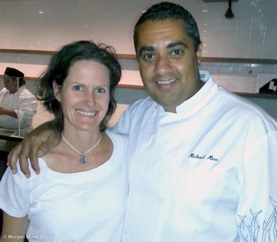
It was also a pleasure to work with Michael Mina. He is full of passion and enthusiasm for what he is creating. He was kind and supportive to his staff and I could see why he was enjoying so much success.
Michael Mina says, “My philosophy on cooking is my philosophy on life: create balance and harmony”.
That’s exactly what I aimed to bring to Pabu with my artwork.
Enjoy your Halloween! I will try and remember “balance and harmony” before I dive into the candy bowl.
Warm Regards,

Looking Forward… Go Giants!!!
Also:
Next Wednesday evening I am giving a talk in Palo Alto at the Pacific Art League called “Seven Essential Steps to Launching an Art Business.” Please forward the invitation to your creative friends!

